 Steps to Success - creating containers
- Create a new HTML file in NotePad
- Add the following markup:
<!DOCTYPE html PUBLIC "-//W3C//DTD XHTML 1.0 Transitional//EN" "http://www.w3.org/TR/xhtml1/DTD/xhtml1-transitional.dtd">
<html xmlns="http://www.w3.org/1999/xhtml">
<head>
<title>The might div element</title>
</head>
<body>
<div id="banner">This is the banner area</div>
<div id="sidenav">This is the sidenav area</div>
<div id="content">This is the content area</div>
<div id="footer">This is the footer area</div>
</body>
</html>
- Save as containers.html
The Division Element
We have put the content into containers using the division element (div).
Divisions, like paragraphs are also block elements; they can contain content.
Therefore divisions must have an opening and closing tag.
The attribute id defines the selector.
- Create a file in NotePad and add the following code:
- id selector is defined by the # symbol within our style sheet, and by the use of the id attribute within our HTML document - for example id="sidenav".
- body selector is set to 0 for the padding and the margin. Usually the margin and padding are set to the browser default if not specifically set to 0.
- Save as layout.css
- Link to the external style sheet, layout.css in the <head> element of containers.html using the following markup:
- Save both files and preview in a browser
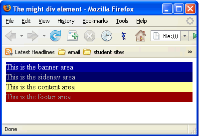
Notice the page is split into coloured divisions or containers.
/* CSS Document */
body{
margin:0;
padding:0;
}
#banner{
background-color:#000099;
color:#ffffff;
}
#sidenav{
background-color:#000066;
color:#CCCCCC;
}
#content{
background-color: #FFFF99
}
#footer{
background-color:#990000;
color: #999999;
}
Notice:
Now we can start playing with the layout.
The banner we will leave as it is, which is at the top.
We want the sidenav on the left with the content flowing beside it on the right
The footer will be at the bottom of the page.
It should look like this:
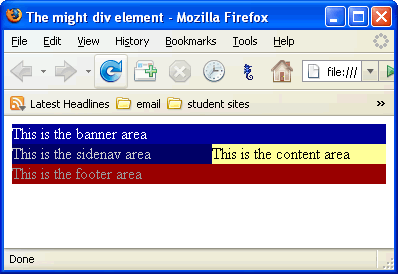
To get the sidenav to stay on the left we will use the property float and we will give it a width of 180 pixels.
Note: The width of the average monitor is now 1024 pixels. There are still some monitors that only have a width of 800 pixels. Most web designers design for a width of 800px.
- Add the following code (in red) to layout.css:
/* CSS Document */
body{
margin:0;
padding:0;
}#banner{
background-color:#000099;
color:#ffffff;
}
#sidenav{
background-color:#000066;
color:#CCCCCC;
float: left;
width: 180px;
}
#content{
background-color: #FFFF99
}
#footer{
background-color:#990000;
color: #999999;
} - Save both files and preview in a browser. It should look like this:
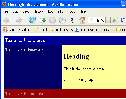
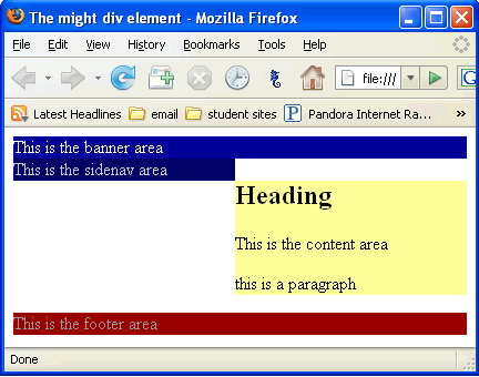
Let's add more content in the content area. We know eventually that area is going to have more than one line of text.
- Add a heading and a couple of more paragraphs to containers.html.
- Save both files and preview in a browser. It should look like this:
Yikes, that's not quite what we want.
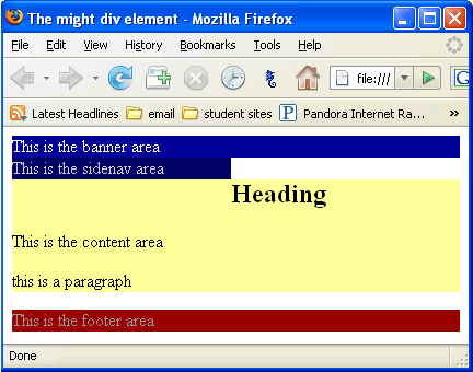
The content is flowing underneath the sidenav and we don't want that to happen. We can give the content a left margin of 200 pixels.
- Add the following code (in red) to layout.css:
/* CSS Document */
body{
margin:0;
padding:0;
}#banner{
background-color:#000099;
color:#ffffff;
}
#sidenav{
background-color:#000066;
color:#CCCCCC;
float: left;
width: 180px;
}
#content{
background-color: #FFFF99;
margin-left:200px;
}
#footer{
background-color:#990000;
color: #999999;
} - Save both files and preview in a browser. It should look like this:
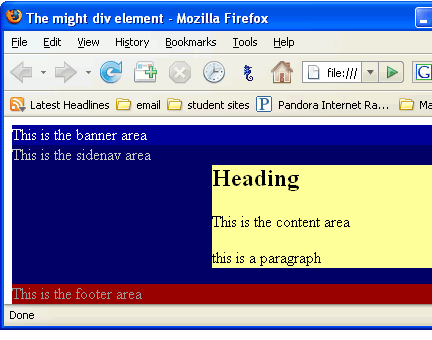
Here we go, now we are getting closer.
But it still looks a little messy with too much white space where we don't want it.
So let's do a little trick.
We are going to put all the containers into one big container and call it wrap.
We need a new <div> in the html and a new rule in the css.
- Add the following code (in red) to layout.css:
/* CSS Document */
body{
margin:0;
padding:0;
}#wrap{
background-color:#000066;
}#banner{
background-color:#000099;
color:#ffffff;
}
#sidenav{
background-color:#000066;
color:#CCCCCC;
float: left;
width: 180px;
}
#content{
background-color: #FFFF99;
margin-left:200px;
}
#footer{
background-color:#990000;
color: #999999;
} - Add the following markup (in red) to containers.html:
<!DOCTYPE html PUBLIC "-//W3C//DTD XHTML 1.0 Transitional//EN" "http://www.w3.org/TR/xhtml1/DTD/xhtml1-transitional.dtd">
<html xmlns="http://www.w3.org/1999/xhtml">
<head>
<title>The might div element</title>
</head>
<body>
<div id="wrap">
<div id="banner">This is the banner area</div>
<div id="sidenav">This is the sidenav area</div>
<div id="content"><h2>Heading</h2>
<p>This is the content area</p>
<p>this is a paragraph </p></div>
<div id="footer">This is the footer area</div>
</div>
</body>
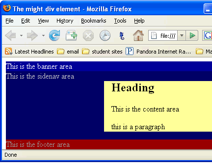
</html> - Save both files and preview in a browser. It should look like this:
Finishing touches.
The text is too tight to the sides of the containers. We'll add some padding to the banner, the sidenav and the footer.
Add padding:6px to all three containers in layout.css
- Add the following code (in red) to layout.css:
- Save both files and preview in a browser. It should look like this:
- Set the width of the wrap to 800px and change the background-color of the wrap to yellow
- Save both files and preview in a browser. It should look like this:
/* CSS Document */
body{
margin:0;
padding:0;
}
#wrap{
background-color:#000066;
}
#banner{
background-color:#000099;
color:#ffffff;
padding:6px;
}
#sidenav{
background-color:#000066;
color:#CCCCCC;
float: left;
width: 180px;
padding:6px;
}
#content{
background-color: #FFFF99;
margin-left:200px;
}
#footer{
background-color:#990000;
color: #999999;
padding:6px;
}
/* CSS Document */
body{
margin:0;
padding:0;
}
#wrap{
background-color:#FFFF99;
width:800px;
}
#banner{
background-color:#000099;
color:#ffffff;
padding:6px;
}
#sidenav{
background-color:#000066;
color:#CCCCCC;
float: left;
width: 180px;
padding:6px;
}
#content{
background-color: #FFFF99;
margin-left:200px;
}
#footer{
background-color:#990000;
color: #999999;
padding:6px;
}
Basically that is how the profesionals do it.
Here is another pro in action and he does it a bit differently than me.
http://www.youtube.com/watch?v=GwQMnpUsj8I
Here are some examples of the above code in action:
- this web site uses divs and id with css
- whllondon.com
- a-zworld.ca
- allangoldconsulting.com
- goldracing.com
- bcgehr
Go ahead and view the page source.
View the css. (see demo on how to view the css)
The only difference with these sites and your steps page is the use of background images.
Guess what we are going to look at next!?